Analytics
Context
This project simulates an executive workforce analytics environment using synthetic data to demonstrate decision-driven analytics, executive reporting standards, and scalable data modeling practices.
The Challenge
Senior leadership required a consistent, enterprise-wide view of workforce trends to support strategic planning, identify emerging risks, and ensure alignment across multiple business units. Existing reporting was fragmented, reactive, and lacked the executive-ready clarity needed.
The Approach
Designed an executive-ready analytics framework that centralized workforce data, standardized KPIs, and automated reporting workflows. The solution emphasized clarity, interpretability, and alignment with leadership decision-making rhythms.
Tools & Methods
Power BI (Executive dashboard design)
Power Query (M) for data transformation
Data modeling & relationships
KPI standardization
Automated reporting logic
Impact
Enabled leadership-style analysis of workforce trends, risk indicators, and planning scenarios through a single, reliable source of truth. The solution demonstrates how standardized metrics and executive-focused design can improve confidence, speed, and alignment in strategic workforce decisions.
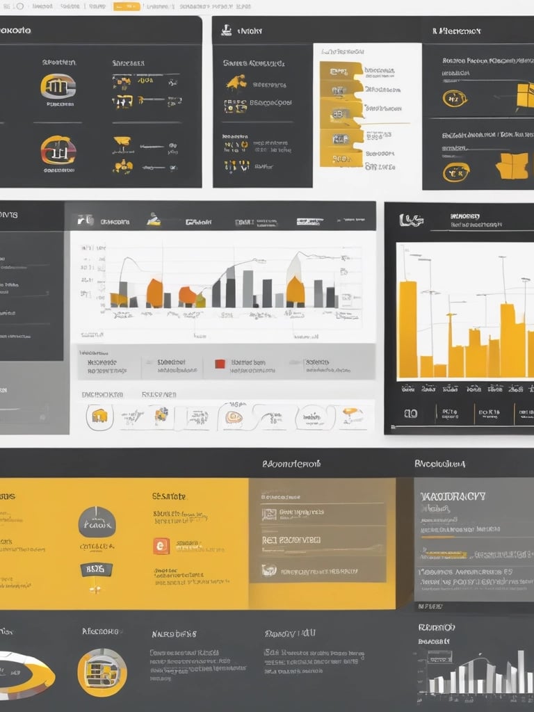
Executive Workforce Analytics Dashboard
Executive Reporting · Workforce Analytics · Power BI
This project uses synthetic data to reflect real-world executive analytics scenarios while maintaining confidentiality and ethical data practices.
Context
This project explores sample human resources data to answer foundational workforce questions commonly faced by organizations. It focuses on workforce composition, demographics, job satisfaction, and employment status to demonstrate early workforce analytics and business intelligence capabilities.
The Challenge
Organizations often struggle to gain a clear, consolidated view of workforce trends across departments, roles, and demographics. The challenge was to transform raw HR data into an accessible dashboard that highlights key workforce insights while supporting exploratory analysis.
The Approach
Designed an interactive HR analytics dashboard that aggregates employee data into clear metrics and visual breakdowns. The dashboard enables users to explore workforce distribution, education background, age groups, gender representation, and job satisfaction across roles and departments.
Tools & Methods
Tableau (dashboard development)
Data modeling and aggregation
Workforce metric definition
Exploratory demographic and satisfaction analysis
Impact
The dashboard provides a structured view of workforce characteristics and engagement indicators, demonstrating foundational HR analytics skills and domain understanding. This project represents an early analytics model that informed later, more advanced executive workforce analytics work.
This project uses synthetic/sample HR data and does not reflect any real organization.
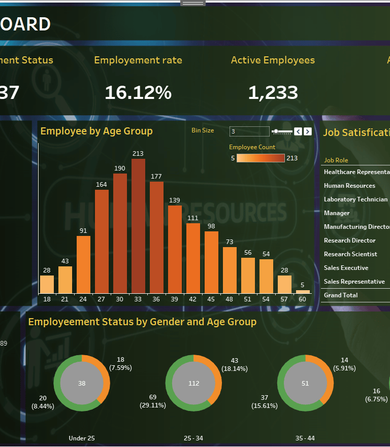
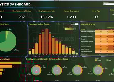
Workforce Insights Dashboard
Foundational HR Analytics
Context
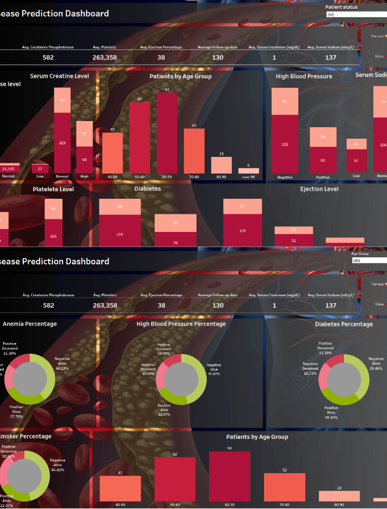
This project analyzes historical cardiovascular health data to explore patterns and risk factors associated with heart disease outcomes. The goal was to apply analytical thinking to a real-world problem while emphasizing interpretability, exploratory analysis, and data-driven insight rather than clinical prediction.
The Challenge
Cardiovascular disease remains the leading cause of death globally, yet understanding how multiple health indicators interact can be complex. The challenge was to organize disparate health variables into a coherent analytical view that highlights meaningful relationships without overstating predictive certainty.
The Approach
Built an interactive analytics dashboard that visualizes key patient attributes such as age, blood pressure, diabetes status, anemia, and ejection fraction. The solution focuses on segmentation, distribution analysis, and outcome comparison to support exploratory insight and informed interpretation.
Tools & Methods
Tableau (interactive dashboard design)
Data cleaning and feature preparation
Descriptive and comparative analysis
Visual segmentation and filtering logic
Impact
The dashboard enables users to explore how combinations of health indicators correlate with outcomes, supporting hypothesis generation, risk awareness, and data-informed discussion.
This project uses publicly available, non-confidential data and is intended for analytical demonstration purposes only.
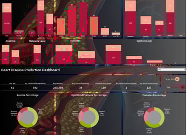
Heart Disease Analytics Dashboard
Applied Analytics – Cross-Domain